


Chapter 7 of Mastering Work Intake: From Chaos to Predictable Delivery dives into the nuances of using XmR charts for four flow metrics. They are:
- Cycle Time
- Throughput
- WIP
- WIP Age
This chapter is hugely useful. Read it carefully and read it more than once. Three points struck me during this read of Chapter 7.
The first point is creating an XmR chart for cycle time data. Over the years, I have used X-Y scatter plots to represent cycle time data. A cycle time scatter plot shows the relationship between how long it takes to get something done and the completion date. The scatter plot shows patterns, clusters of data, and correlations. This chart is extremely useful; it might be my go-to chart. The result is not a run chart and can’t be the X portion of the XmR chart. Between Chapter 7 and Appendix B, Vacanti shows how to create a run chart for this type of data (note-to-self, pay more attention to appendices). As a reminder, a run chart shows how a single variable changes over time. The data is ordered sequentially on the X-axis and the duration on the y-axis. If two observations occur on the same day, plot them sequentially. As we have seen in earlier chapters, the XmR allows us to use rules to distinguish between noise and signal. A cycle time run chart clearly shows each piece of work that finishes in order of its completion. The scatter plot may no longer be my go-to cycle time chart. To give you a sense of the difference between the two charts, I grabbed 20 observations and created comparison charts.

The second is the discussion of chunky data caused by rare events. I have recently been working with teams with a sustainable product support component. We are using a Kanban’y version of Scrumban (pretty sweet) therefore work enters and completes regularly. There are no big gaps. On the other hand, the classic plan-based teams and Scrum teams tend to have long gaps between events. Flow metrics aren’t fond of chunky data. The idea that struck me was to measure the time between the rare events and use that to create a daily rate for the event. The formula would be the event measurement / the amount of time. For example, I once worked with a Scrum team that only completed work on Fridays, therefore the throughput run chart would spike on Fridays and would be zero on the other six days of the week. Let’s say that on Friday 14 stories were completed and implemented. The daily would be 14/7 = 2. The XmR chart would be built using the days the team delivered one or more stories. An example of how the two approaches would differ visually using the two approaches is shown below.
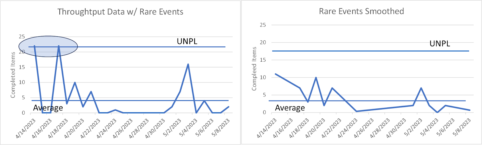
It should be noted that using the raw data the X chart would suggest that the observations from April 14th and 17th are signals while the smoothed data does not.
The third area that piqued my interest was the discussion of charting Work in Process (WIP) Age. Vacanti discussed two approaches in this chapter but made a stronger case for using total Work in Process (WIP) time rather than average WIP time for the WIP Age run chart. Creating an XmR chart from averaged data is possible but hides all sorts of possible ills because of the smoothing effects of averages. If you are plotting WIP age daily (or any other period), instead of averaging the current age of all WIP for the period sum the age for each item. The variability of how work flows through the system will be apparent in your WIP data instead of averaging everything out. High degrees of WIP age variation is a marker for work intake problems.
Chapter 8 deserves two or three reads to absorb all the nuances and techniques. For a novice in using flow metrics, the number one message in this chapter is you can’t just open up EXCEL (or your tool of choice) and randomly create charts. For a grizzled veteran, the message is there is still a lot to learn.
Buy a copy and get reading – Actionable Agile Metrics Volume II, Advanced Topics in Predictability.
Week 1: Re-read Logistics and Preface – https://bit.ly/4adgxsC
Week 2: Wilt The Stilt and Definition of Variation – https://bit.ly/4aldwGN
Week 3: Variation and Predictability – https://bit.ly/3tAVWhq
Week 4: Process Behavior Charts Part 1 – https://bit.ly/3Huainr
Week 5: Process Behavior Charts Part 2 – https://bit.ly/424O5Wc
Week 6: How Much Data? – https://bit.ly/47GVP24
Week 7: Detecting Signals – https://bit.ly/3SjwfdO


