


We continue with Chapter Four of Actionable Agile Metrics Volume II, Advanced Topics in Predictability, titled Process Behaviour Charts, this week. Today we construct an XmR chart.
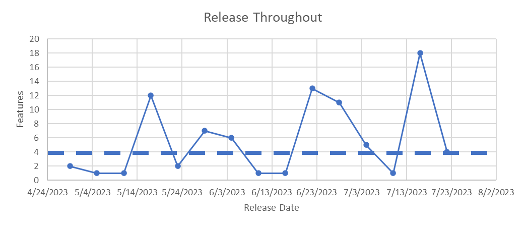
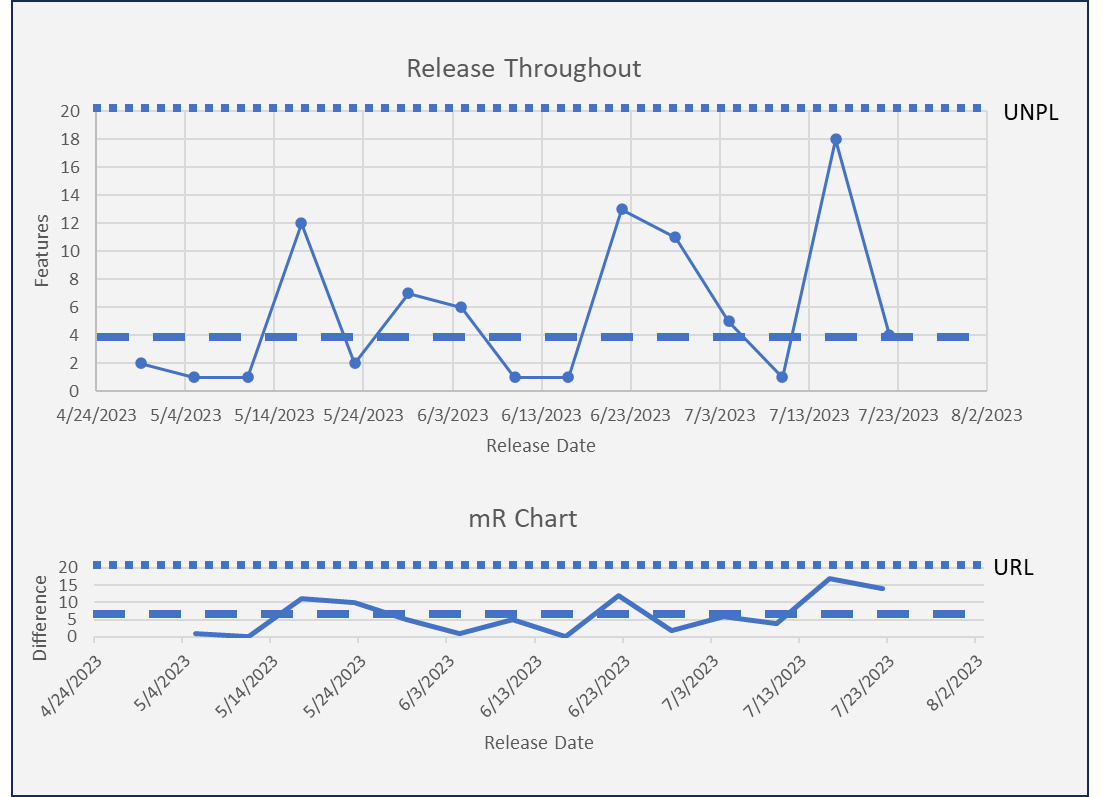
We begin with the X Chart which provides a visual representation of the data over time. I constructed this chart below in MS Excel using the X-Y Scatterplot option. The dashed line is the arithmetic average. Vacanti calls this the center line and it is to orient the person looking at the graph to the center. It is not to make predictions or for forecasting. I would also suggest calculating the median to understand the skew in the data (it is better than eyeballing it). In this case, the median and average are nearly the same. While the X Chart with centerline is useful, I strongly recommend not jumping to conclusions and making inferences from the data until we build the entire XmR chart and consider all the interpretation rules in the next chapter. The chart is shown below:
Why wait? Humans often fall prey to seeing trends when they don’t exist. One of the interpretation tools are Natural Process Limits. Natural Process Limits – also called Shewhart Limits, for the X Chart are calculated using the following formula:
NPL = Average ± (2.66 * Average Moving Range)
Plus for the Upper Natural Process Limit (UNPL) and minus for the Lower Natural Process Limit (LNPL). Plotting the NPLs indicates how much of the variation shown in the chart is natural and what is exceptional. Observations outside the NPLs are exceptional. The X Chart with both the center line and UNPL is shown below. Note the LNPL is not shown because it is below zero and feature deliveries can not go below zero.
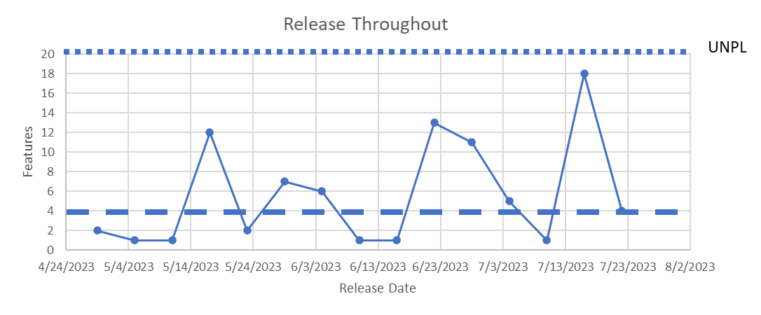
None of the releases shown are above the UNPL. If all data points fall completely within the two limits, then the process is said to be operating under common causes only. Which is true in this case.
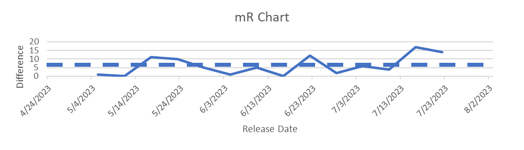
The Moving Range Chart (mR), measures successive samples’ differences. The author suggests that this is the best measure of process variability. The moving range is calculated by taking the absolute difference between individual measurements at the same location from two consecutive groups. Note each successive sample must be logically comparable. For example, if a fundamental change in how the sample was taken or measured comparison is illogical.
Severe shocks to the system should cause you to consider whether data on either side of the shock is comparable.
The mR chart for the release throughput data in the X Chart above is shown below.
An Upper Range Limit (URL) for the mR chart is calculated for this new chart as well using the formula:
Upper Range Limit = 3.27 * Average Moving Range
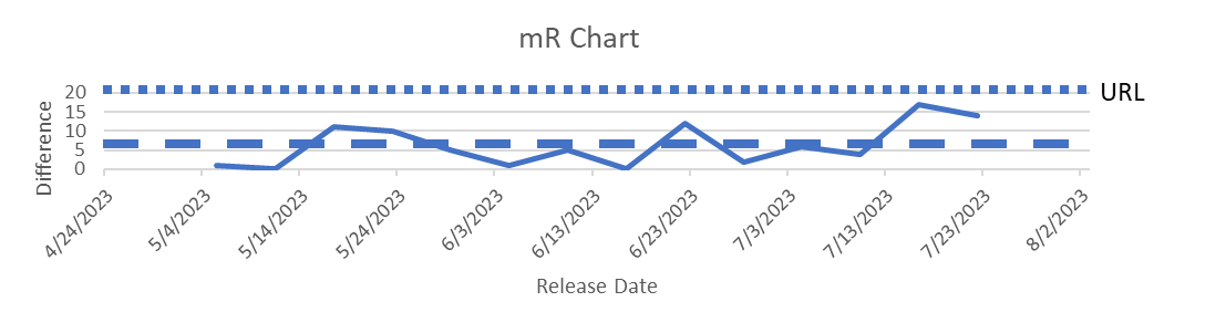
No observations exceed the URL. Nothing is exceptional. All of the variation is common cause (not driven by any individual incident).
Combining the two charts delivers an XmR Chart aka, the Process Behavior Chart (PBC).
Next week we will add more tools to interpret the PBC. I will also find some spicier data 🙂
Buy a copy and get reading – Actionable Agile Metrics Volume II, Advanced Topics in Predictability.
Week 1: Re-read Logistics and Preface – https://bit.ly/4adgxsC
Week 2: Wilt The Stilt and Definition of Variation – https://bit.ly/4aldwGN
Week 3: Variation and Predictability – https://bit.ly/3tAVWhq Week 4: Process Behavior Charts Part 1 – https://bit.ly/3Huainr


