


Charts. The chapter corrected a misconception I have had for at least twenty years which we will get to in Part 2 of our re-read of chapter 4 (we are taking two weeks on this chapter to set up chapters 5 and 6). Thanks, Mr. Vacanti.
Humans like to find patterns and assign reasons to those patterns. We have discussed pattern recognition biases in the past, and that bias is a problem. However, even before we can fall prey to this type of bias we need to move past large tables of data. Tables are useful as input into analysis but they are nearly impossible to understand the global behavior the data represents. Visualization is required to combat bias and identify global behavior.
The first a-ha moment is the introduction of Shewart’s rules for the presentation of data.
Rule 1: “Data should always be presented in such a way that preserves the evidence in the data for the predictions that may be made from the data”
The implications include that for each chart you need a table of the data (and vice versa) and the context of the data collected needs to be preserved. For example, a run chart (a time series chart) needs to include the date. I will let you go and check the PowerPoint presentation you made this week to consider just how badly you (and I) fluffed Rule 1. Since reading Chapter 4 over the holidays, I have insisted that the data the charts were created from are in the appendix.
A quick test…what is wrong with this chart?
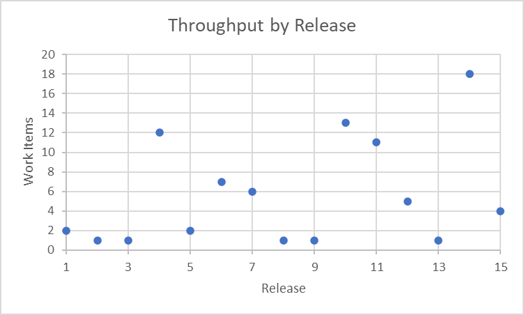
The dates of the releases are not shown, which obscures the context (which I will fix when we use the chart to build an XmR chart next week).
Rule 2: “Whenever an average, range, or histogram is used to summarize data, the summary should not mislead the user into taking any action that the user would not take if the data were presented in a time series.”
Using the data from the chart above,
Average Release Size: 6 work items
Range of Release Sizes: 1 – 18 work items
Not mentioned in the quote from Vacanti, the median is 4 work items (50% above and below that point) which suggests a skewed distribution.
And for good luck, the histogram is:
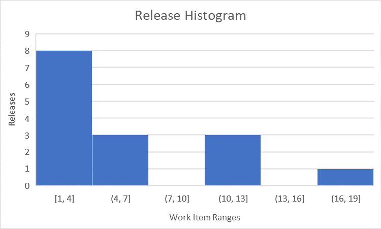
Any of these statistics could be interpreted incorrectly without the context of time. We will leave you this week with a quote that Vacanti provides from Dr Wheeler “Data have no meaning apart from their context.”
Next week we will build an XmR chart and explore understanding data.
Buy a copy and get reading – Actionable Agile Metrics Volume II, Advanced Topics in Predictability.
Week 1: Re-read Logistics and Preface – https://bit.ly/4adgxsC
Week 2: Wilt The Stilt and Definition of Variation – https://bit.ly/4aldwGN
Week 3: Variation and Predictability – https://bit.ly/3tAVWhq

